MYDREAM
Amy and Joel Perez, who together make up Mindful Software, Inc., weren’t satisfied with the existing mobile apps for dream interpretation, so they decided to build their own: MyDream. I knew Joel from having worked with him at Rocket Communications. He and Amy happened to be in the market for
a UX Designer at the same time as I was looking for a new project, so it felt like serendipity. MyDream wouldn’t be the first dream interpretation app to use AI, but Amy and Joel saw an opportunity to improve the experience by pulling in life context, to make the dream interpretations more personally resonant.
THE PROBLEM
Create the best dream interpretation app on the market
MY ROLE
Sole Designer – User Research, Interface and Interaction Design, Visual Design, Usability Testing,
TIMELINE
Ongoing
THE RESULT
TBD
Launch forecasted for Q2 2025
RESEARCH
Competitive Analysis
Opportunity Matrix
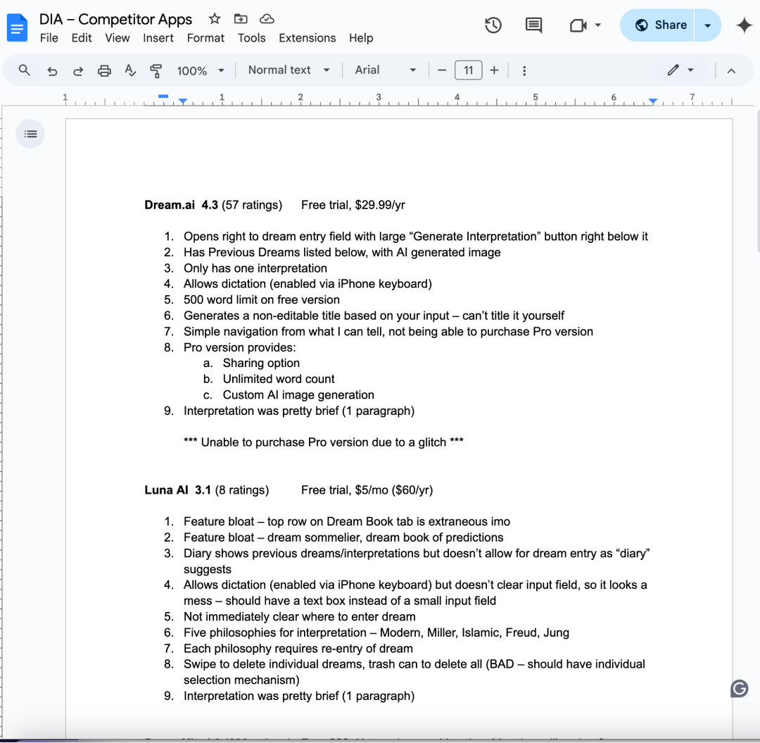
My competitive research started with my downloading nine of the leading dream interpretation apps on the iPhone app store. These apps varied in functionality, with some being simply dream symbol dictionaries, and others being AI-enabled dream interpreters. One thing I noticed they all lacked was community, something that my partners had mentioned wanting to include in our app.
I also walked through the apps to see where they failed on usability or functionality, which would hopefully inform what to include or watch our for on our design. Many of the competitors’ apps had extraneous features, such as personality quizzes and information about the phases of the moon, which did not necessarily enhance the experience of dream interpretation.
Many of the apps were easy to use, but that was mainly by virtue of their having limited functionality. Of the apps that were dream interpreters, none of them included a dream symbol dictionary, and most only provided a simple interpretation consisting of a single paragraph. There were clear opportunities for us to create a superior product.
Usability Analysis
I also found many of the apps to have glitches and errors with things like purchasing and input fields. There were also common UX issues, like showing error messages too soon in the interaction, having unclear navigation or unintuitive buttons, and putting unnecessary additional steps in the process.
FIRST ITERATION
Dream Interpretation Flow
Whenever possible, I like to start projects with user research; I typically conduct observational studies or interviews. In this case, I was unable to conduct research for the first few weeks, so I decided to do something I usually disagree with: I started with mockups. I was working with the two owners and it was their vision, so I wanted to play with the Gluestack design system they had chosen and see if we were roughly in alignment. This would also give me something from which to deviate once I was able to conduct research. Finally, I created the perfect splash/loading page illustration after many iterations using Figma’s Freepik AI image generator plugin. I thought it captured the mood of the app and could be vectorized later and possibly be animated.
In this initial flow, the user would enter on the screen displaying their previously entered dreams, from which they could tap the ‘compose’ button to enter a new dream. An interstitial animation will display while the AI processes the interpretation. The user will be able to tap the dream symbols contained in their various interpretations and be taken to the dream symbol (persons, places, things, actions) dictionary to see what each symbol should mean by itself. I expected that I would need to insert screens for the user to add context, though I wasn’t yet clear where they should go or how to ascertain that information — things I hoped research would reveal.
Navigation Evolution
I designed all of the icons. I knew my partners wanted to include life context, but the rest was based on what I’d learned from my competitive research.
Accessibility
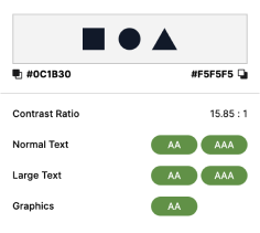
A final note on the visual design choices: I went with a dark theme to account for users who might be using the app in the middle of the night, and therefore don’t want a bright screen in an otherwise dark room. I also was mindful to ensure all color combinations would meet a minimum contrast ratio of 3.00:1 for large text and graphics, and 4.50:1 for normal text.
RESEARCH
User Interviews & Observations
My goal in conducting interviews and observations was to derive a good, standard, repeatable method for dream interpretation. Having never been interested in dream interpretation personally, I did not know what steps and questions it entailed. I was able to speak with four potential users and three dream interpretation experts, to help determine what features would be needed and how the app should flow. Participants ranged from hobbyists to college psychology professors, and there was a lot of variance in how they did things. What was consistent, though, was the idea of dream symbols – figuring out what symbolic meaning each person, place, thing, or action held for the dreamer; specifically within the context of the dream, as well as what emotions were brought up. We didn’t have a clear repeatable process yet, but we did know what was needed to interpret a dream.
USER FLOW AND SECOND ITERATION
Dream Interpretation Flow
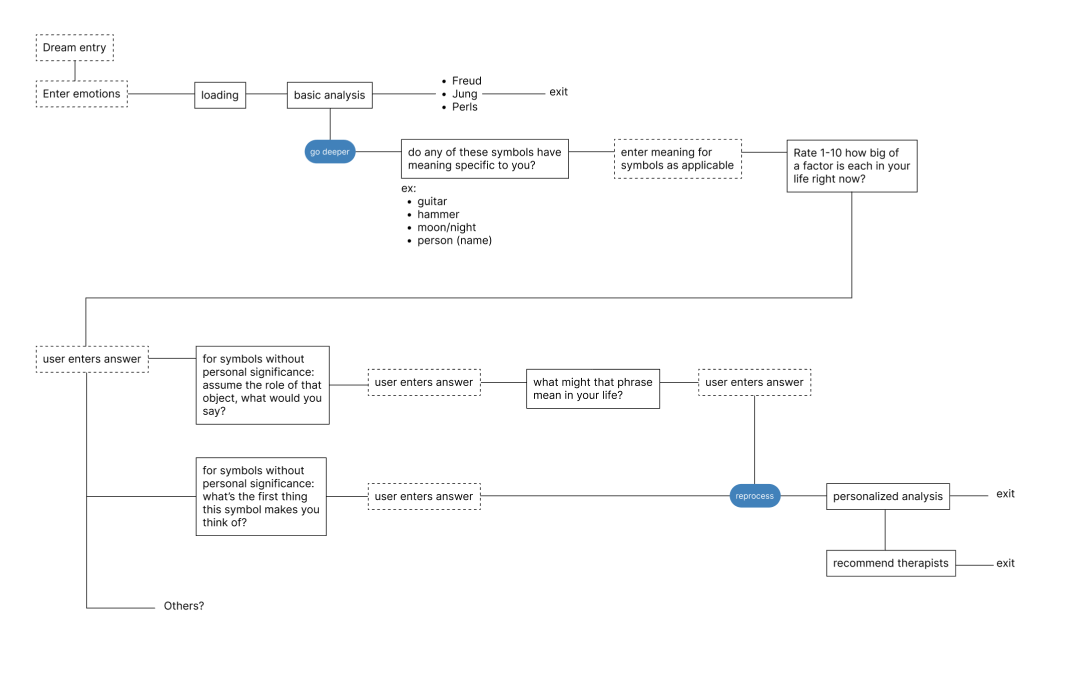
I created a simple user flow based on what I learned from the interviews and observations. At this early phase, we thought it would be useful to provide interpretations from the perspectives of dream-focused psychoanalysts Sigmund Freud, Carl Jung, and Fritz Perls. We also thought it might be desirable to steer users to further psychotherapy by making recommendations of therapists in the user’s area.
Emotional State
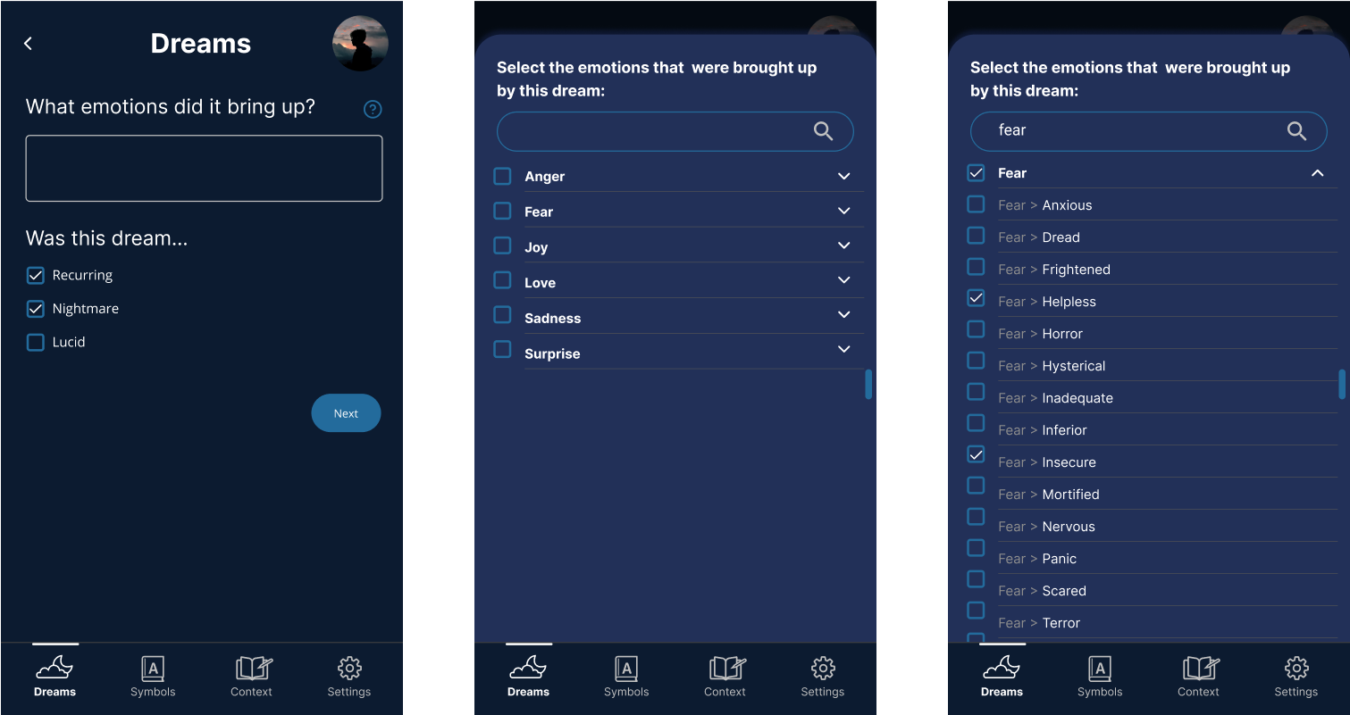
I decided to include a way to enter/select emotional state, despite assuming the AI would be able to infer it contextually. Users would be able to type in their emotions, or tap the question mark button to pull up a searchable drawer of an emotional vocabulary to choose from.
Symbol Meaning
Users would be prompted to enter meaning for each symbol. For symbols that didn’t have a clear meaning to the user, they would be prompted to either free write about what the symbol makes them think of, or, using a gestalt approach learned from professor of psychology, give voice to that symbol, with its meaning being derived from what the user thought the symbol might say were it alive.
Life Context
At this point I also started thinking about how to pull in life context. Though the information entered here would aid the dream interpretations by being referenced by the AI, it would not be a part of the dream interpretation flow. It would instead act as a sort of journal where users could either free-write about their lives or answer prompts.
OTHER SECTIONS
Community Section
Two of our interviewees stated that their process often included reaching out to friends who are into dream interpretation to get their take, so I started work on the community section and updated the navigation to reflect that. The big challenge here was to avoid turning this into a full-blown social media app, and to try to restrict conversations to only being about dreams, so the plan was to have conversations originate from the dreams via the share link.
The updated navigation
Sign in/Sign up
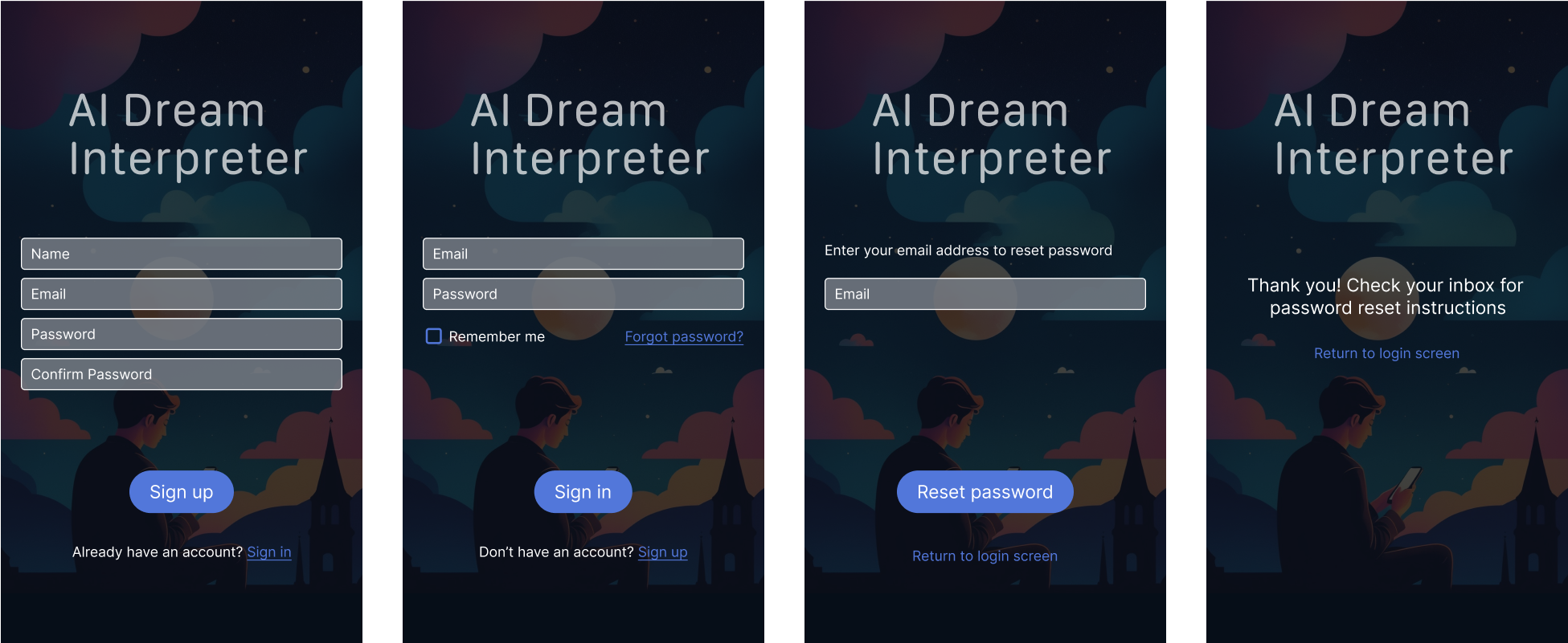
I also knew we would need sign up screens, so I started creating them. More was needed, and there would be future evolution, but I wanted to at least get the process started.
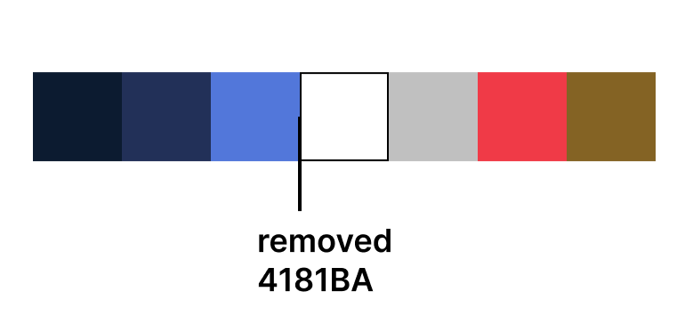
One simple but important change that occurred at this point was to change out the blue color for a similar shade of purple. The blue color was not chosen intentionally, so I circled back and found a shade of purple that would compliment the rest of the color palette while also maintaining our set WCAG standards. Error and alert colors were also chosen at this point, as I started designing for deletion and highlighting. For highlighting, I went with a very dark shade of yellow, which passes WCAG AA against the background for graphics (3.12:1 ratio), while also passing against the white and grey colors for normal text (5.12:1 and 4.99:1, respectively).
Color Design
Updated color palette
First pass at highlighting and deletion
USABILITY TESTING
I was able to run a usability study with nine participants. They were people who Joel and Amy knew personally and were already involved in dream interpretation. I worked from a script that started by telling them what to expect during the testing session, which set them at ease about what was expected from them.
Prototyping and Testing
I then moved on to having them complete tasks, such as recording a dream and submitting it for interpretation, and sharing their dream once the interpretation was complete. I was interested not only in knowing whether the dream interpretation flow made sense and was navigable, but also how desirable the app was, and certain features in particular were, to potential users.
I used Axure for its robust prototyping capabilities. However, I still found a big challenge in creating a prototype for an AI-powered app to mimic how the back-and-forth interaction between human and computer would be replicated without actually using AI.
To solve for that, I decided to use pre-loaded answers for text fields like dream entry and emotional state, so there would be consistency across participants. I explained to users upfront that they would not need to enter the dream, and that the pre-loaded answers would populate once the participant typed a single key. The interpretations were also pre-loaded but would populate the screen in such a way as to mimic ChatGPT.
Data Analysis
I recorded each of the testing sessions, after which I used Miro to compile and organize feedback and findings. I organized Miro so that it mirrored the test script horizontally, while I assigned each participant a color to keep track of who said what. After I recorded
all of the notes from the videos, I went back and created affinity clusters where users did or said similar things. I recorded these patterns using black post-its, so they would stand out from the rest.
What we learned
Feedback on dream interpretation flow
A majority of users thought symbols should be defined and emotions entered before the initial interpretation, though both should be skippable. It was also uncovered that terms like “lucid,” “symbols,” “Gestalt,” and “free association” were not clear to all users. Additionally, the smiley face system for resonance rating, though just a placeholder for testing, was deemed inappropriate, as some users may have had a scary or sad dream.
Dream symbol dictionary/definitions
Three of our nine users thought the symbols dictionary should only include symbols the user had already defined or made selections for, one user thought it should be an exhaustive dictionary of symbols, while four thought it should probably be both. Two users called out that it should be acceptable to not have an answer for any or all dream symbol meanings.
Sharing dreams and interpretations
Five of our nine participants had trouble identifying the share button due to the icon being unfamiliar. The idea of sharing dreams as a post was generally not well received, with four participants stating they would prefer to share to specific friends in more of a messaging format.
Trends and patterns
I had not asked about trends and patterns because it was not even on our radar as a feature we might consider but three of our participants volunteered that it would be one of the most attractive features to get some sort of data about what themes, emotions, or symbols came up and what to do with that information.
THIRD ITERATION
Implementing learnings from testing
Definitions
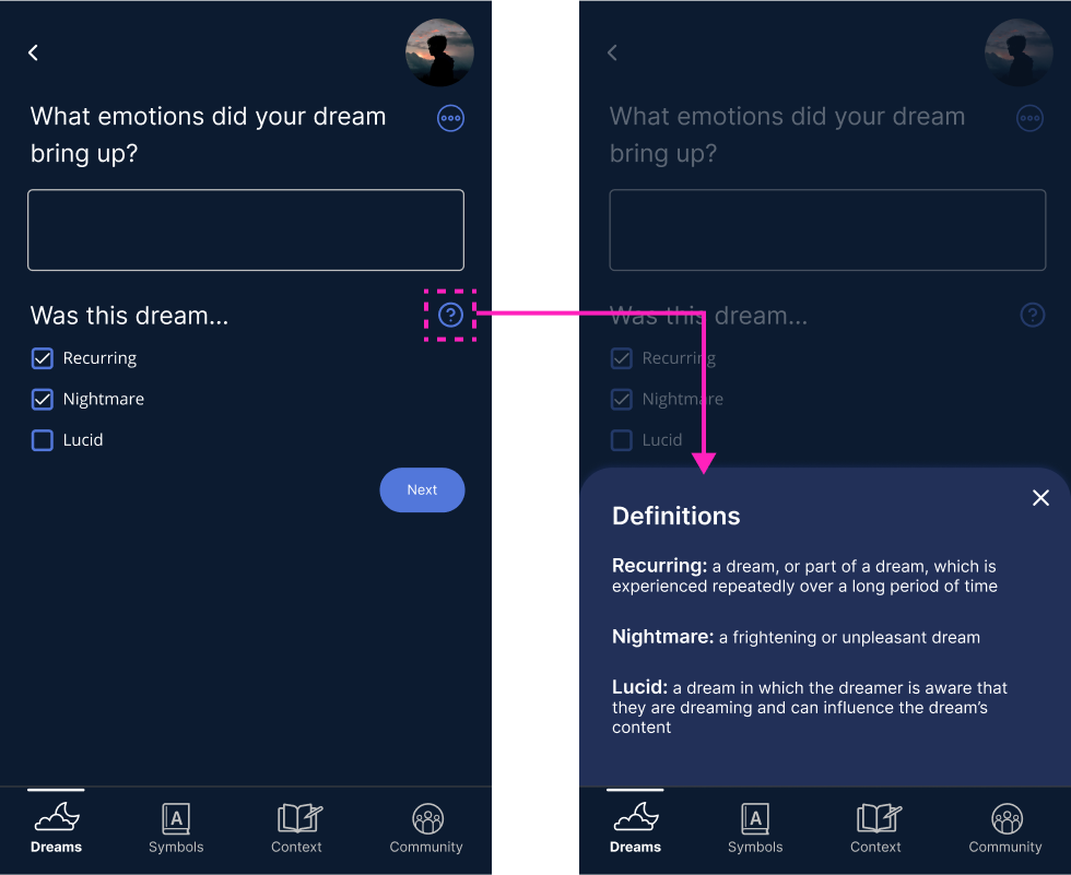
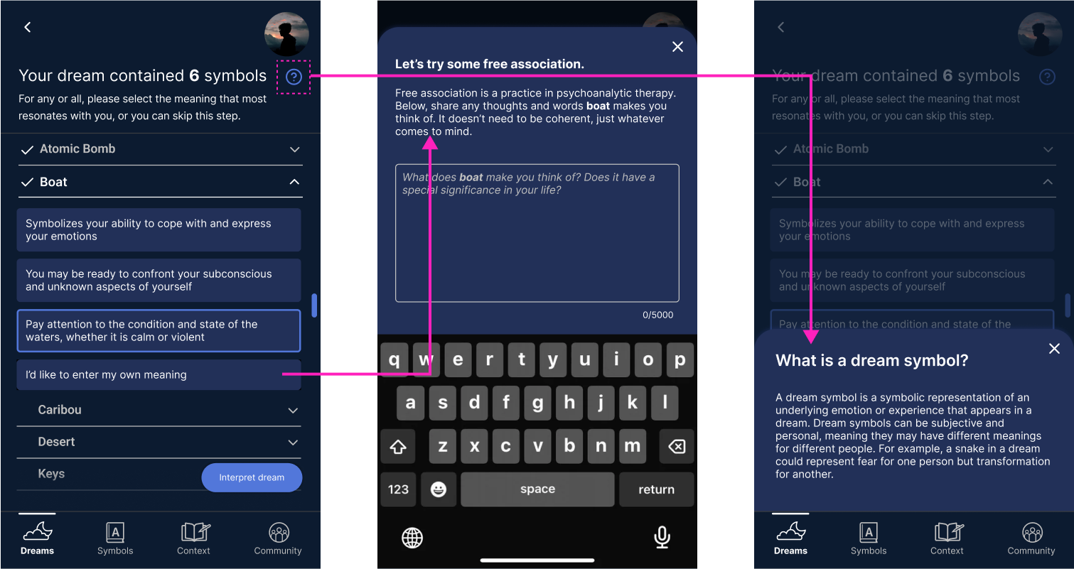
To help users who were unfamiliar with dream terminology, I added a drawer of definitions for “recurring,” “nightmare,” and “lucid.” I also updated the drawer where users can enter their own meaning by explaining what free association is. Finally I added another drawer to explain what a dream symbol is.
Symbol Meanings/Dictionary
I updated the Symbols section with a segmented button that would allow users to toggle between the symbols for which they had already chosen a meaning, and the larger symbol dictionary. The larger dictionary would feature hundreds of symbols and function the same way as the symbol definition screen (in the dream interpretation flow) – providing selectable definitions and allow the user to enter their own. Once a symbol was defined in the dictionary, it would show up in the other “My Symbols” tab.
Navigation Update
Due to participants thinking the community feature should function more like messaging than social media posting, I added “Messages” to the navigation, thinking that would resemble an inbox, while the “Community” section would be where one could find, view, and manage connections. I also updated “Dreams” to be “myDreams” to add to the feeling of personalization, and to match the app name. I also added a Home tab, which will be elaborated upon next.
Home/Analysis
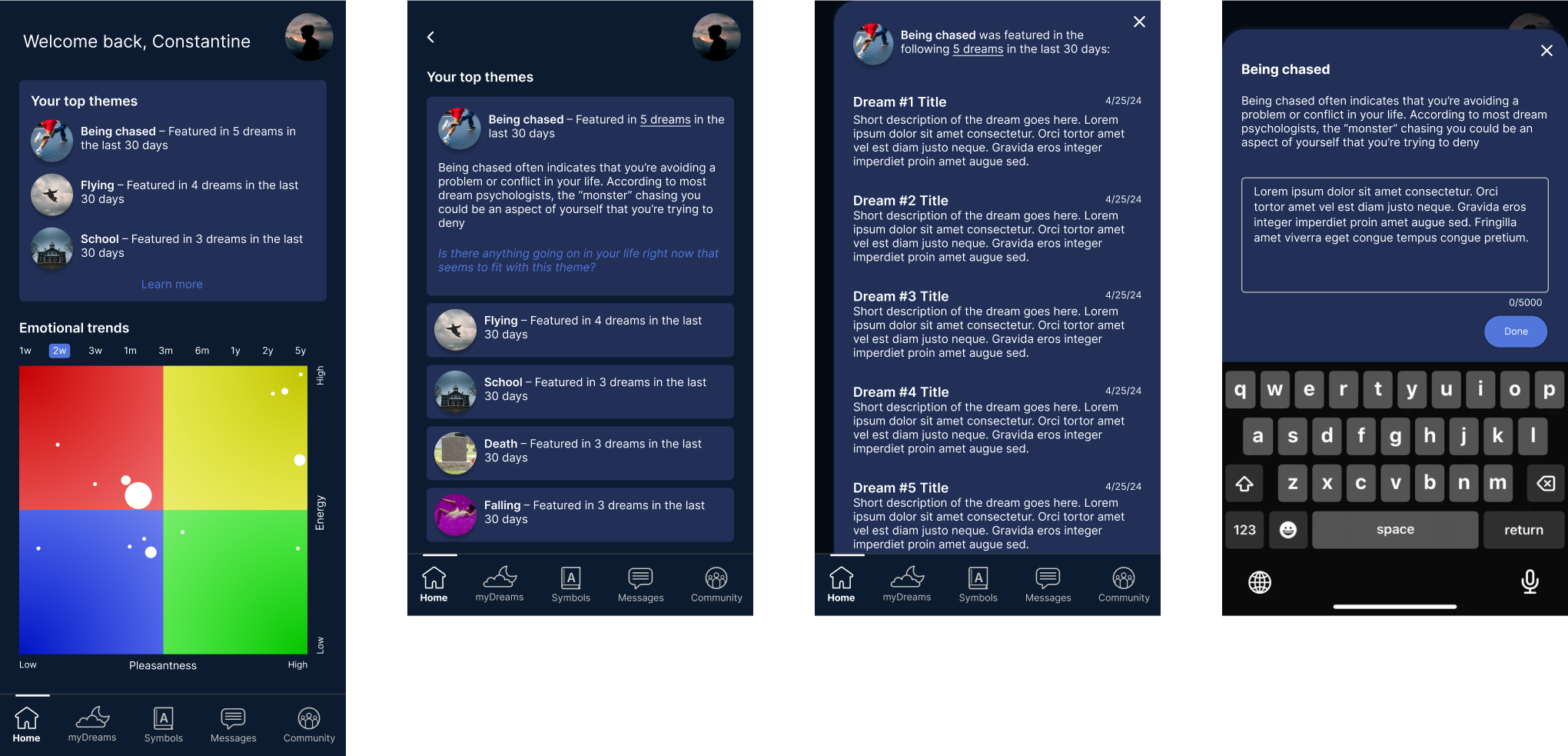
Some of our participants had voiced a desire for a Home screen. Up to now, we were working on the assumption that the Dreams tab would serve as the home, as users would presumably want to see their previous dreams first. After hearing from participants that trends and themes would be a useful and desirable feature, we thought it might make sense to lead with that instead.
Community
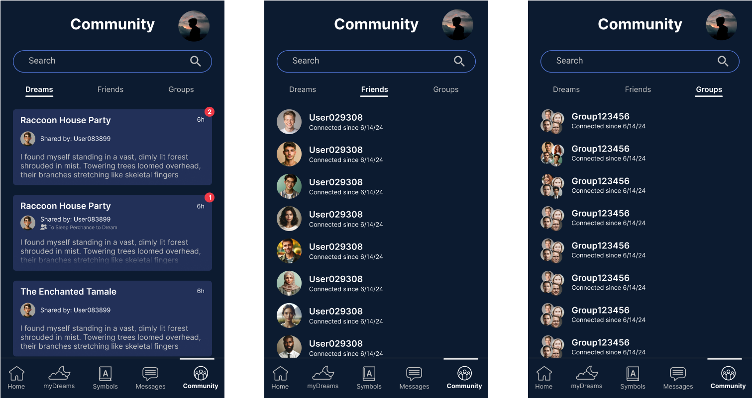
Originally, the Community section was conceived of as being analogous to social media apps, with “Dreams” being shared posts and the other tabs, “Friends” and “Groups” being where one could manage their connections and groups to which they belonged, respectively.
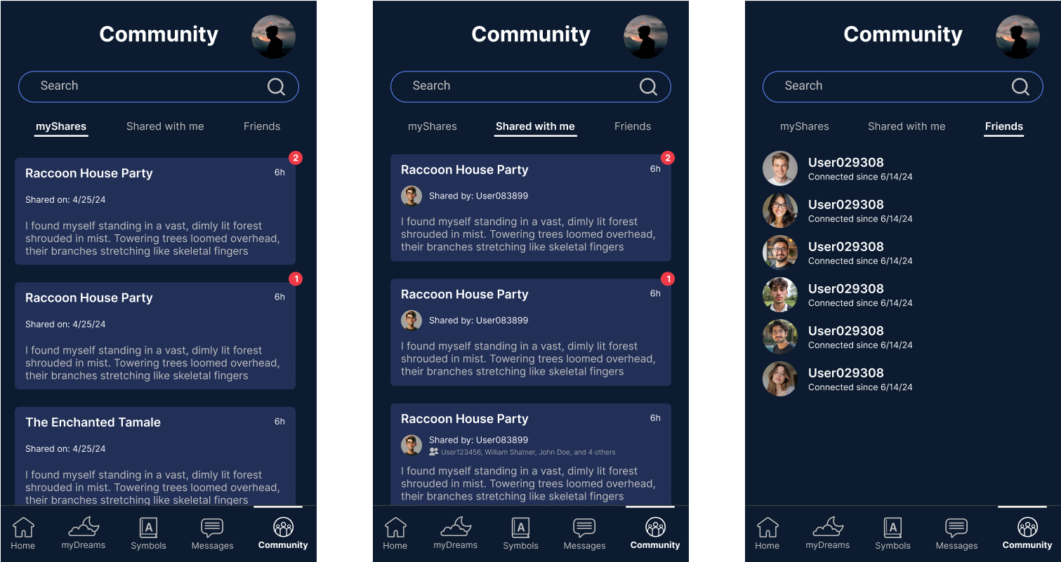
Post-usability testing, I decided to delineate shares made by the user (myShares) and shares made with the user (Shared with Me), while maintaining another tab under which the user could manager their connections (Friends). This was a step in the direction of making the Community more like a messaging app than a social media app, because the focus was more on the dreams being shared than the users’ connections. And while a user would still be able to share a dream to a group of friends, we were no longer thinking about groups as their own entities, which would require many additional considerations.
Navigation Update
More than half of our participants had some difficulty finding the “compose” button. Since the primary feature of the app was to enter dreams for interpretation, I felt it was crucial that users be able to locate easily. To achieve this, I moved it from the dream history page and made it universal, larger, and centered it in the navigation.
Additionally, since we didn’t have clear data that users would want to see their trends/analysis first (and such a section was only alluded to by three of our nine participants) we reconsidered leading with it. Some users had voiced interest in having a proper home page, but we did not have a consensus on what features they hoped to find there. We decided to once again make the user’s dream history the de facto home page, since none of our participants objected to it and since we knew the user’s dream history provided value to all users rather than what we had to assume would be a a smaller percentage of users.
SCREEN FLOW
Putting it all together
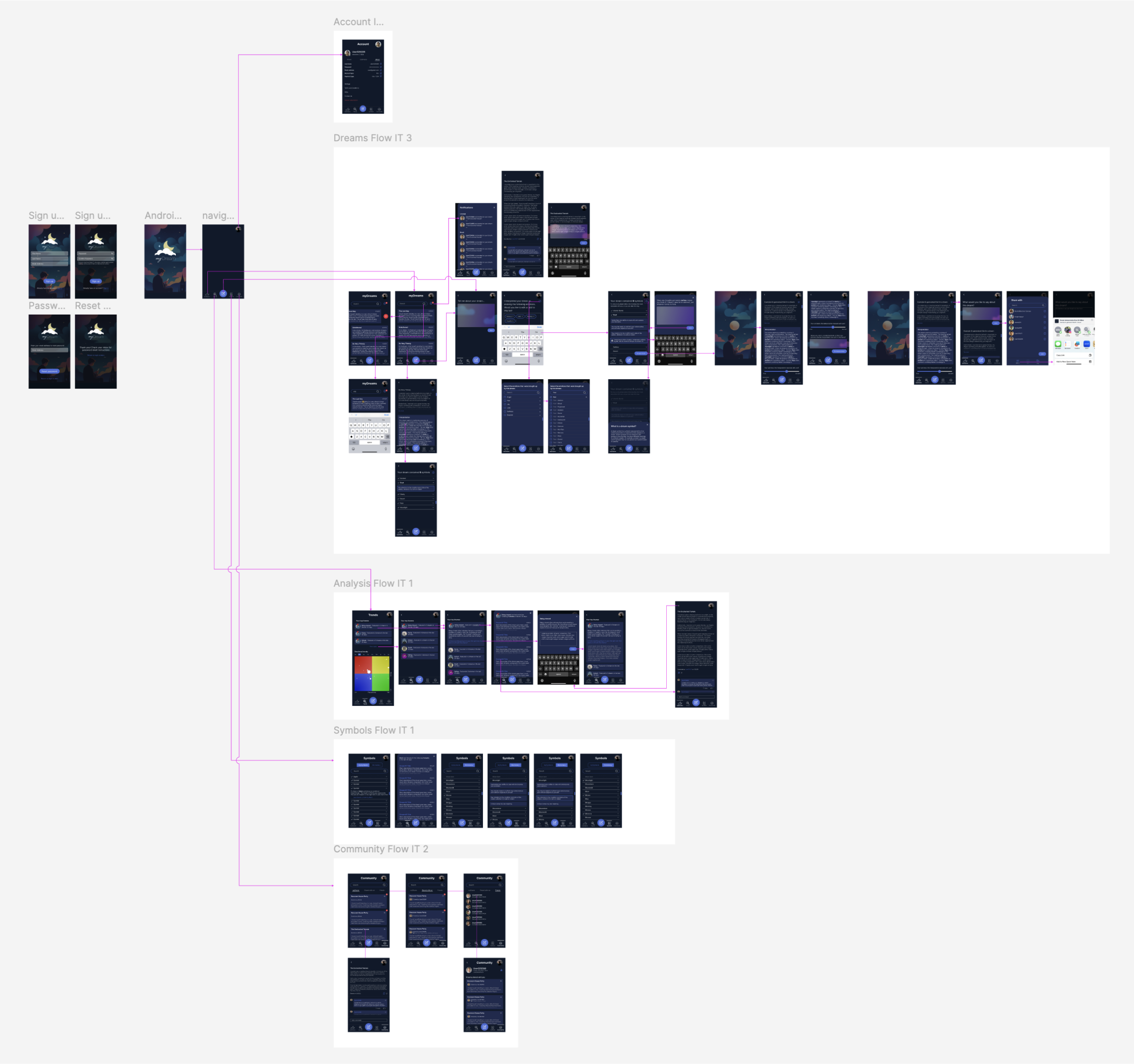
I had previously created screen flows for the Dream Interpretation and Trends sections of the app, but with the creation of sections like Community, Account, and Sign up/Sign in, and with the evolution of the Symbols/Dictionary section, I thought it was time to start creating a coherent, holistic picture of how everything fit together. There were still screens to be created, but this would give our developers what they needed to begin building.
TO BE CONTINUED…
Current state and lessons learned
MyDream has entered development and is forecasted to launch Q2 of 2025. Our engineering team is using AI tools like Builder.io to streamline development, which has required me to make sure all screens are designed with auto layout applied to every layer. I had been using Figma’s auto layout feature to help me design screens more quickly and consistently, but now it is actually imperative that it be applied everywhere for easy ingestion by the AI. I am extremely proud of the work my team and I have done to date, and look forward to continuing to refine the screens and flows to make MyDream the best dream interpretation app on the market.
There are a few things I would do differently if I could start over. One would be to put research first. We might have been able to launch sooner if we had started with a clearer concept of what users want.
Second, I would have organized my workspace better. I am usually good at this, but given the unusual and somewhat murky start of this project, I didn’t know how to organize my work, so I just kept each week’s work in its own lane. This worked well enough, and my organization evolved with the project, but it made it a bit annoying, early on, to keep everything straight.
Finally, I would have stuck to the design system more closely. My partners decided at the beginning of the project, for a number of reasons, that we would work with the Gluestack design system. Given that Gluestack was not built specifically for MyDream, there were a lot of components that would have to be custom built. As I got rolling with screen creation, I sometimes lost sight of Gluestack entirely and would create components that didn’t need to be built, only customized (e.g. input fields, text areas). The result of this was that I needed to go back through the screens and update them with Gluestack components and then make the customizations where necessary. This was not a herculean task, but it did cost me some time.


