M&M MERCHANDISERS
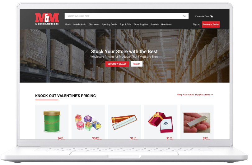
M&M Merchandisers is a wholesaler based in Ft Worth, TX with a catalog of over 7,000 products. M&M knew they wanted an updated eCommerce experience to streamline their sales process. They wanted to decrease call volume by making it so each retailer could get their correct pricing and place orders online instead of having to call a sales person.
Move current website to Shopify and streamline processes, focusing largely on restructuring their catalog architecture to make browsing more intuitive.
THE PROBLEM
MY ROLE
Sole UX Designer: Interaction Design, UI Design
TIMELINE
12 Weeks
THE RESULT
A reduction in time spent by sales representatives
New and existing customers can enter the site, find what they’re looking for, and check out with little to no assistance
M&M is able to utilize business resources more efficiently
Employees can automate repetitive, time consuming tasks, such as updating product information and inventory data
ANALYSIS
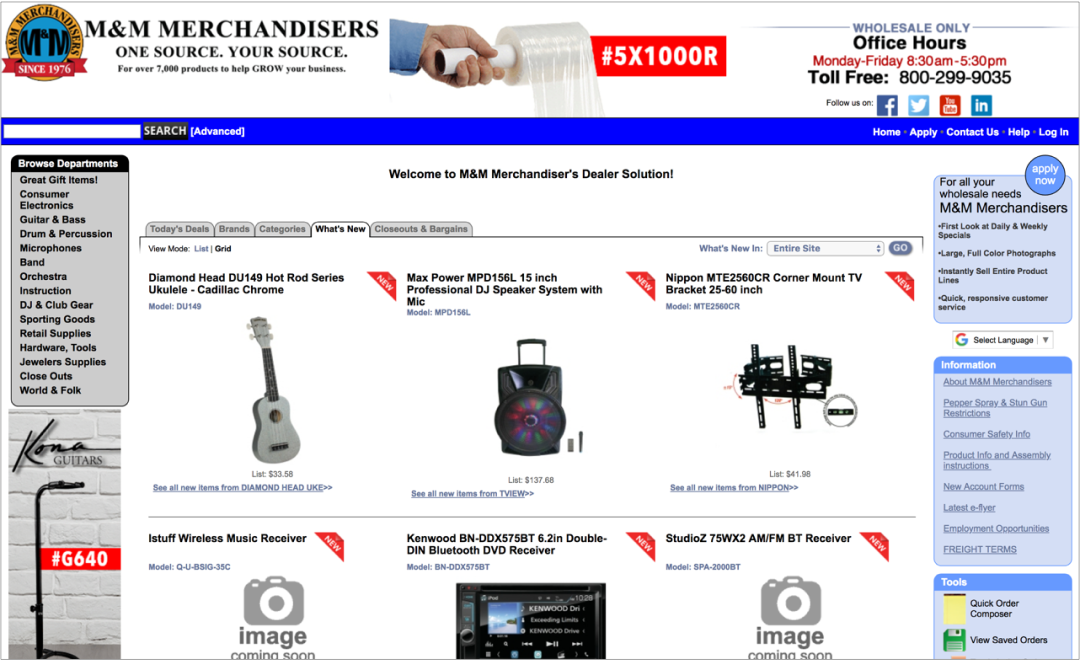
M&M’s website was visually outdated and cluttered. It was also difficult to navigate, partly due to their having multiple navigation options: on the left, right, and top of the page. The “Apply Now” CTA did not call attention to itself, but got lost in the adjacent elements. There was also a product being advertised at the very top of the page, normally reserved just for the company name and header navigation.
CATALOG ARCHITECTURE
The first problem that needed to be addressed was the inefficient way the information was displayed. For example, there were fifteen product categories, many of which referred to music or musical instruments. The goal was to decrease the number of product categories and subcategories to speed up decision making, per Hick's Law.
HICK’S LAW
The more options a person has to choose from, the longer it will take them to make a decision
I was able to reorganize most of the categories myself by following the lead of retailers in each respective industry and based on what made logical sense. The only place where I needed help was with 18 of the items in their Jewelers Supplies category. I didn't want a catch-all category of “Jewelers' Tools,” but I didn't know how these items should be broken down. To help with this, I called around to local jewelry stores, hoping some actual jewelers would be able to refine my list. Unfortunately, true jewelers seem to be a dying breed, as I found
very few of them – most of the stores I called had only sales people. Of all of the stores I called I was only able to find two actual jewelers, one of whom was nice enough to help me. I stopped by his store and did an open card sorting exercise using Optimal Workshop's Optimal Sort tool (result shown below). I ended up putting a few of these items in multiple places, and losing the "Findings" category in favor of lumping ear nuts (earring backs) together with the earrings M&M also sells.
CHOOSING A SHOPIFY THEME
We knew we were going to relaunch M&M Merchandisers' website using Shopify Plus, which meant we would have to select a theme to start with and then identify, design, and build any necessary customization. Ordinarily, I would play the lead role in researching Shopify themes for the client, weighing business needs against the built-in capabilities and shortcomings of each theme. After that, I would present my recommendations of what I thought was the strongest theme (sometimes the choice is only narrowed down to 2 or 3 themes). In this case however, the M&M team had looked at Shopify themes prior to my starting on the project and had a strong preference for the Empire theme. Having used this theme previously for a similar company, I knew it would also be well suited for M&M and expressed my agreement with their decision. I had a good idea of what Empire could and couldn't do out-of-box, and was therefore able to set to work on theme page mapping (explained later) and customization planning earlier than expected.
I also took that opportunity to build an Axure library of the Shopify Empire theme so I could save time when we got to interaction design. I expected that by creating this Axure library we might also have a head start on future projects. Given this was the second client project I'd been on that used this theme during my time at Codal, chances were good that future clients might also want to use it. I didn't end up building all of interactivity into the library, but all of the structure, sizing, and spacing of elements are set to match the theme.
FEATURE LIST & THEME MAPPING
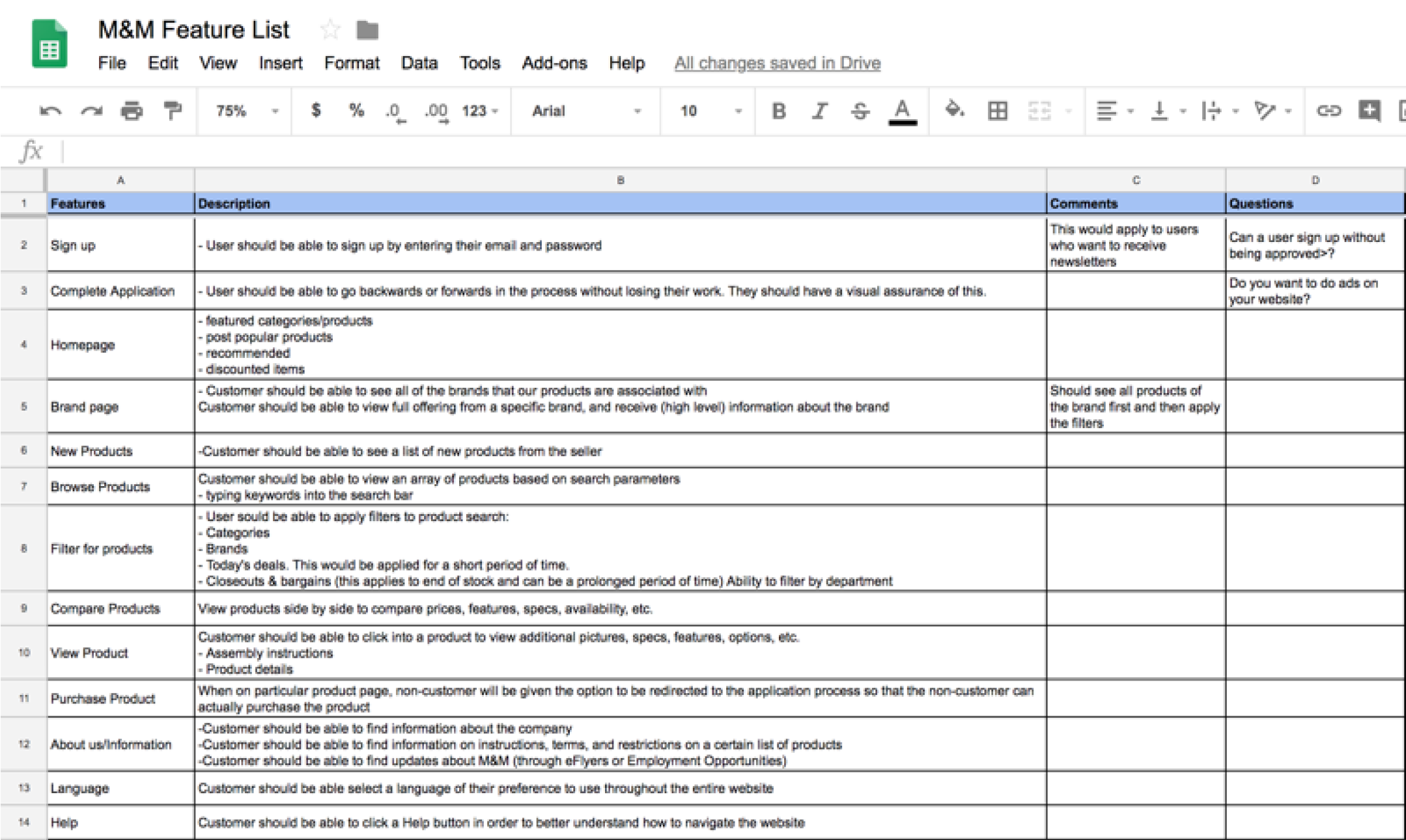
M&M already had a working website that did most everything they wanted it to, so I created the feature list, less to plan out new functionalities, and more to keep track of what was on the existing site so we could later plan where it would go on the new website and how it would be implemented.
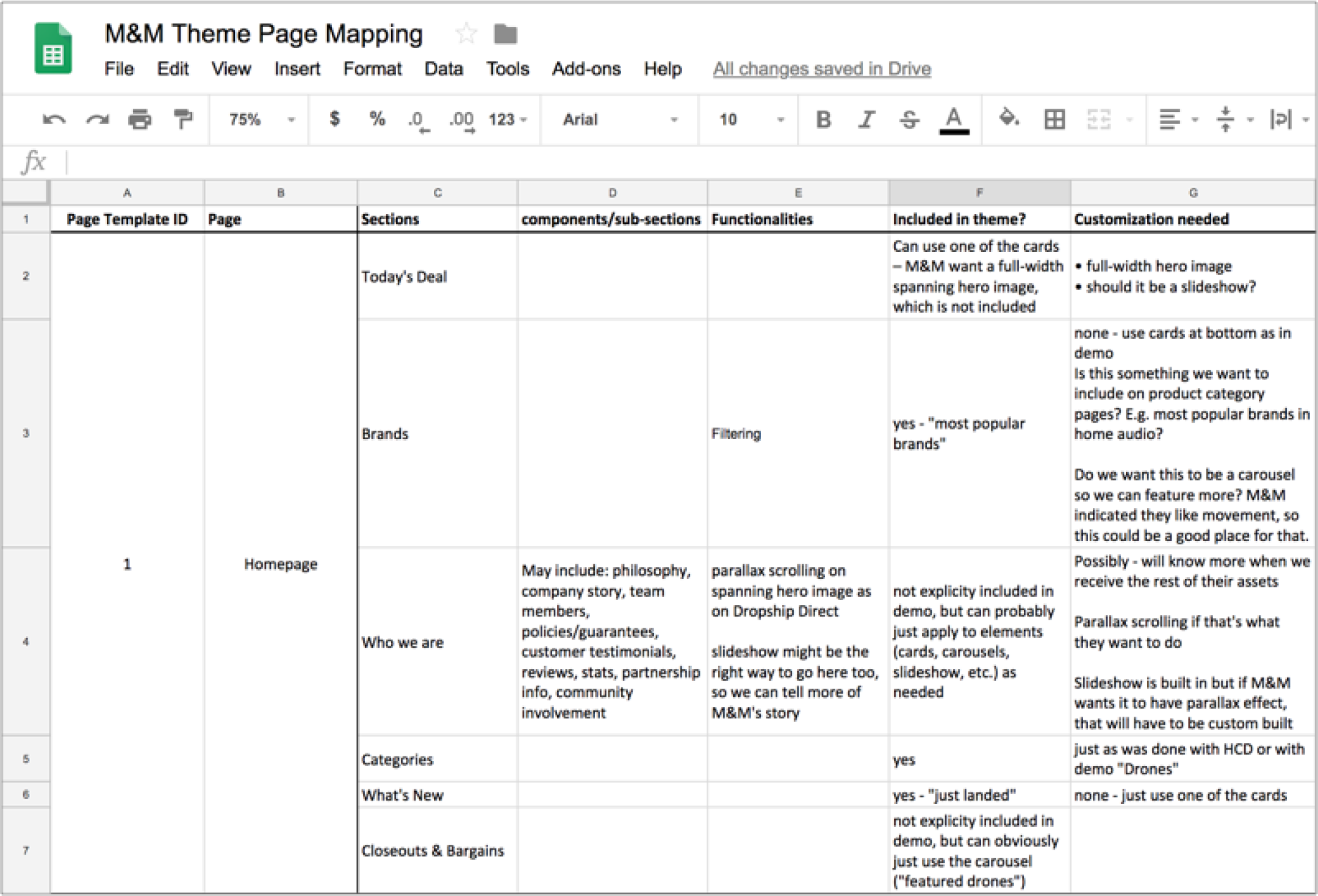
I then created a theme page map to plan out which pages in the theme would most easily accommodate M&M's features and content. Theme pages were listed, numbered and linked on the first tab, while the second tab was a full breakdown of page names, sections/subsections, and functions. Once I squared what M&M needed with what the Empire theme provided, I was able to clearly plan what customization would be necessary on each page. This process, though tedious, was absolutely invaluable to the redesign and migration.
INTERACTION DESIGN
The Website
With a clear understanding of the client's goals for the website and of how we were to accomplish that, I was able to dive into wireframing and prototyping to deliver a website that met their needs. Much of the site could be built using the out-of-box features, but I had to design custom elements like Price Breaks and the Compare Feature. I also wanted to improve on the header navigation provided in the theme, so that the menus show on hover and allow the user to click every level
of navigation (e.g. user can click "Music" or "Guitars" or any subcategory of guitars; three levels of categorization). Finally, I wanted to implement a scroll away header, as opposed to the shrinking header provided out-of-box, to maximize the screen space and make browsing and purchasing easier. To try out the prototype, click the button below
The Application Process
Since M&M is a wholesaler, users cannot purchase from them unless they are registered as retailers. While this meant we couldn't do away with many of the questions on their existing application, there were certainly some areas for improvement. Below is how the first step looked, along with my notes on what changes could be made. I did this for all of the steps and shared my notes with the stakeholders. To view how the updated form looked, click on the prototype button below.
Codal staffed UX and Visual designers as separate jobs. So once the interaction design was done, M&M was handed off to one of their dedicated visual designers to put the finishing touches on it.
LAUNCH
By all measures, M&M Merchandisers was a success. The website launched according to the schedule and budget that were decided at the outset of the project. While I don’t have concrete success metrics, I'm particularly proud of it for the fact that, although I was still pretty new to UX at this point in my career, this project was seen as enough of a success that my company still uses it as in their own case studies, which you can read by clicking the link below.
REFLECTIONS
LESSONS LEARNED
In retrospect, I probably spent too much time working on the prototype. We knew there wouldn't be any usability testing to necessitate a robust prototype, and since it was based on a Shopify theme, there was likely already some form of validation done on their end. Again, I was still pretty new at this point and was learning Axure, which can make one want to go down the rabbit hole of exploring everything it can do. It didn't hurt the project, but I probably could have wrapped M&M and dived into my next project sooner.


