KINDERSPOT

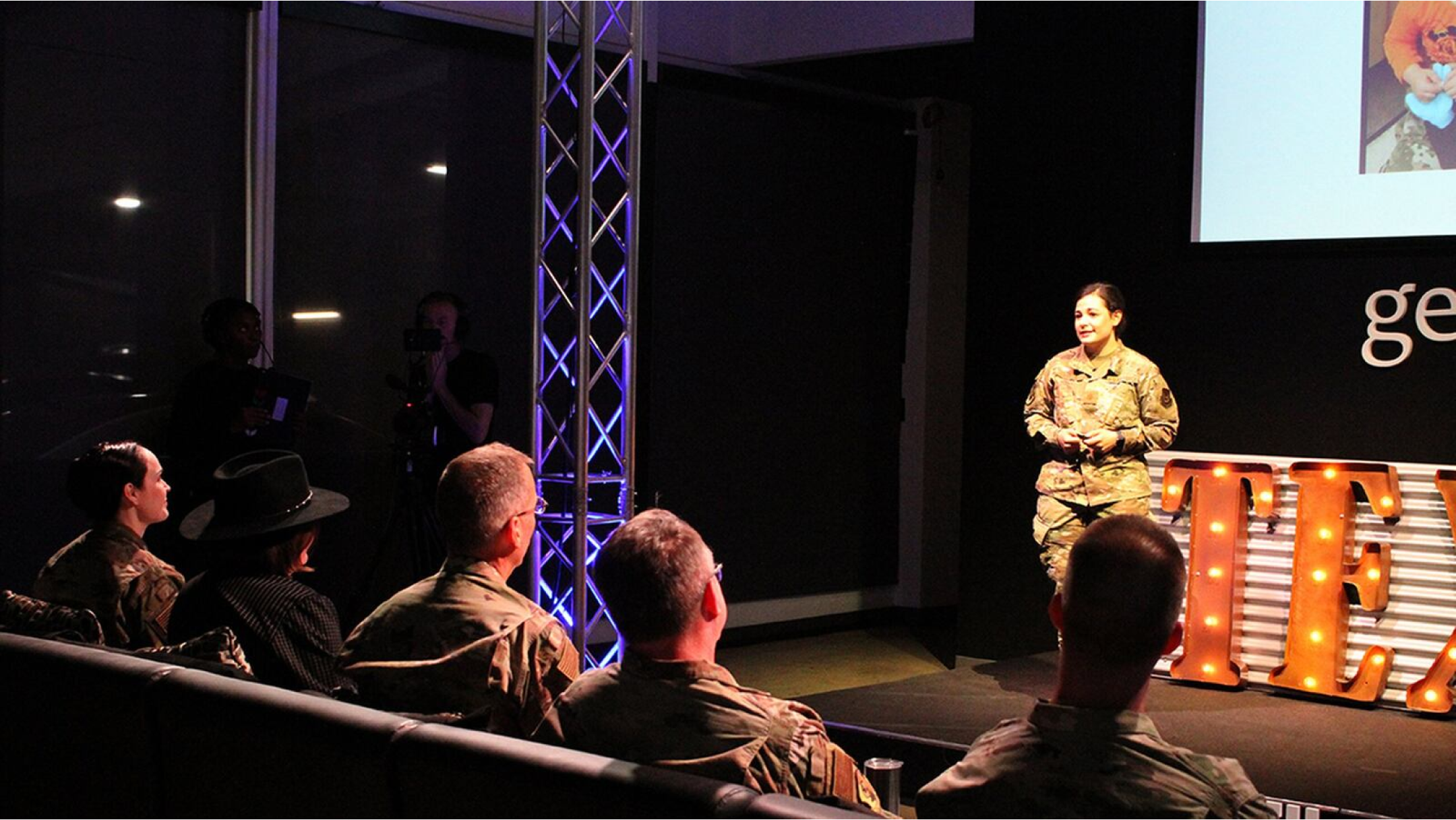
Our mission with Kinderspot was to bring to life Major Jacque Vasta’s vision of an app that would help military members and their families coordinate childcare by subleasing currently-held slots at the DoD Child Development Centers. Major Vasta took first place at the 2020 Air Force
Installation and Mission Support Command (AFIMSC) Innovation Rodeo (pictured below) for her idea and a SBIR contract was awarded to a digital agency based in Washington DC. I worked with two other designers over the course of 16 weeks to complete this project.
THE PROBLEM
Military members and their families need an easy and trusted way to coordinate childcare during temporary duty assignments
MY ROLE
Research, Interaction Design, Usability Testing, Visual Design, Mentor to new hire/junior designer
TIMELINE
16 weeks
THE RESULT:
144% adoption increase in 2 years
Launch Q2 2021 at 9 US-based Child Development Centers; is now offered at all Air Force CDCs worldwide
5-star rating on FB and Apple app store
More than 1,000 downloads on Google Play
RESEARCH
Our work on Kinderspot began with sending out a survey via Google Forms. We received 580 responses from patrons of the Air Force Child Development Centers (CDCs), and 70 responses from employees. The surveys served as a jumping-off point for us to conduct interviews with both patrons and employees of the CDCs, of which we completed 18 and 6, respectively.
The biggest frustrations were A: finding a person to sublet/lease, and B: not having a trusted, sanctioned way to exchange payment for such a transaction. The Child Development Centers were mostly hands-off in these areas, leaving patrons to use social media or Craigslist to find and facilitate these arrangements.
TASK-BASED PERSONAS
Task-based personas focus on users’ goals, behaviors, and tasks rather than personal demographics or characteristics. Unlike traditional personas, they emphasize what users are trying to accomplish and how they interact with a product to achieve those goals. By understanding tasks, we were able to prioritize functionality, create intuitive interfaces, and ensure the product would meet user expectations efficiently. Two of the six task-based personas we identified, and the ones we were primarily focused on at this stage, were TDY Tawny and TDY Tina.
Tawny holds a permanent spot at a Child Development Center and is looking to sublet it during an upcoming temporary duty assignment.
Tina is on the other end of this transaction, trying to find a spot to rent during her own temporary duty assignment.
Important to note: it is often the case that a single user would be represented by both personas, as they could be looking to sublet their spot at their home location, as well as find a spot near their TDY location.
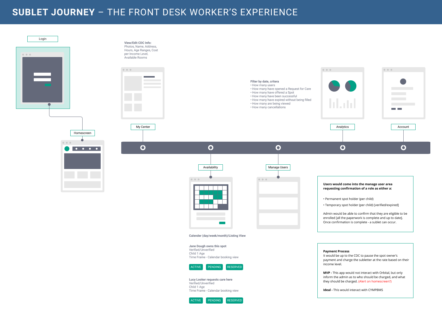
On the administrative side, we focused on Receptionist Rebecca. At the same time we were designing a mobile app for parents to arrange childcare for their kids, we also needed to design a website for Rebecca to manage the flow of kids coming and going to the CDCs.
USER JOURNEYS
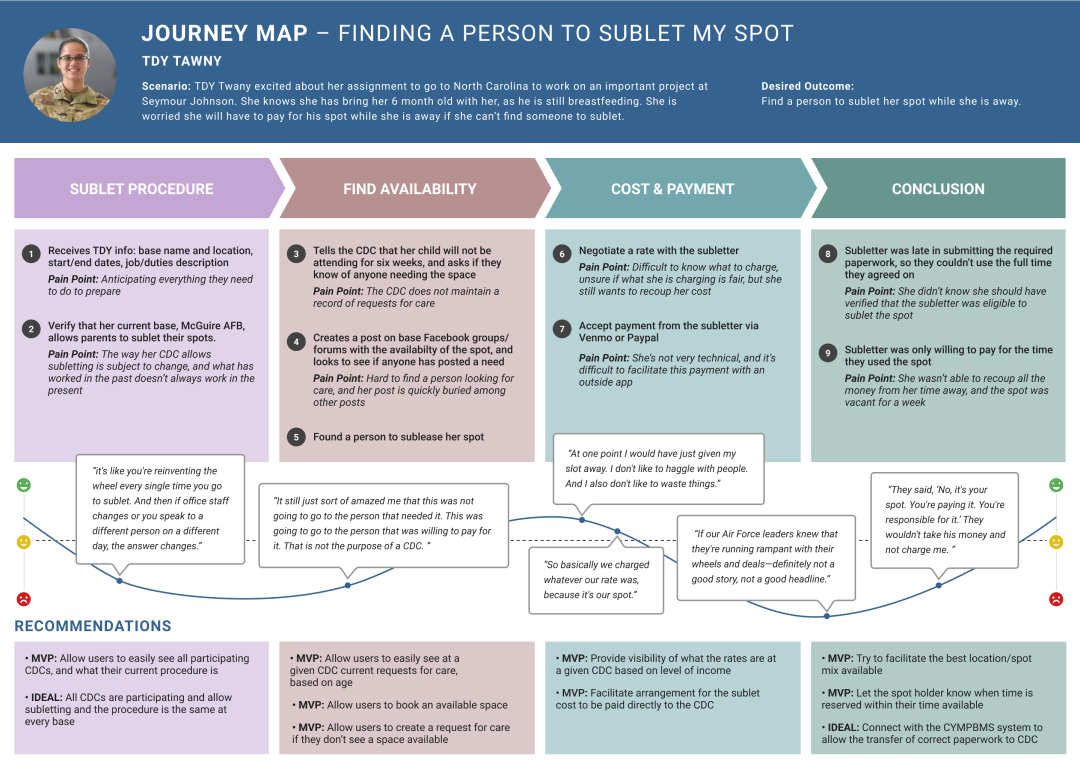
We mapped out the possible steps in each of our personas’ journeys of finding a subletter, finding a spot, and facilitating the subletting journey. We did this to get a holistic picture of the users’ current experiences and identify unmet user needs, both in the MVP and in an ideal future state. The journey maps also aided us in getting alignment with our stakeholders on what needed to be done and why. The process started with our identifying the larger steps in the process and the questions associated with them. Beneath those, we added possible scenarios the user would encounter and indicated their level of frustration in either red, yellow, or green.


The following journey maps represent how we came to understand the existing, pre-Kinderspot experiences of leasing your permanent spot for rent versus finding a spot to rent for a short period, while also moving and changing jobs.


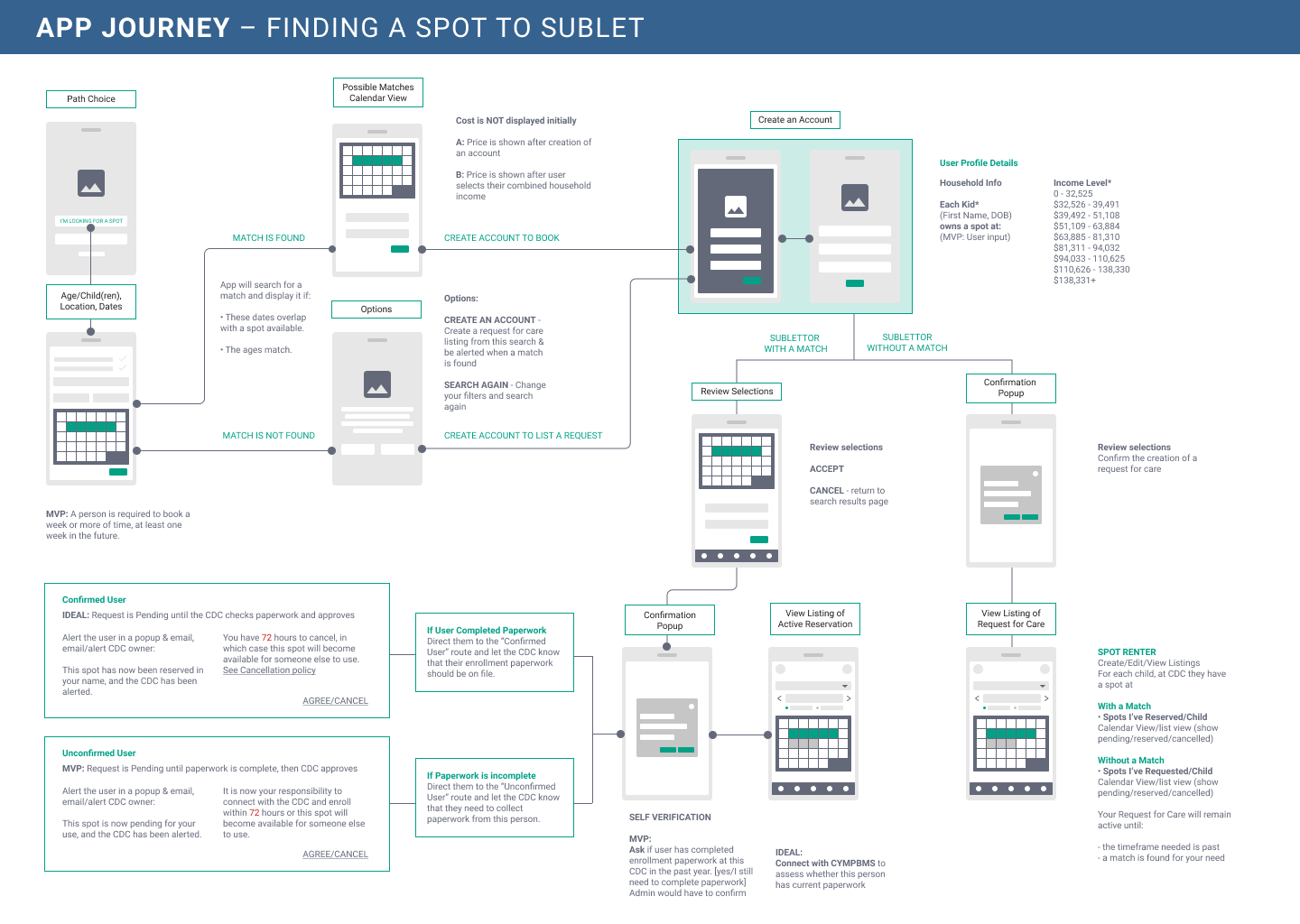
APP JOURNEY
Before diving into designing screens, we created high-level conceptual screen flows that would show the steps a user might take, both for finding a subletter and for finding a spot. Each step on the journey shows the information required from the users and considerations made by the Child Development Centers. Note: after this point, another member of our team focused on the Admin side, while I stayed on the consumer/mobile side.

FIRST ITERATION
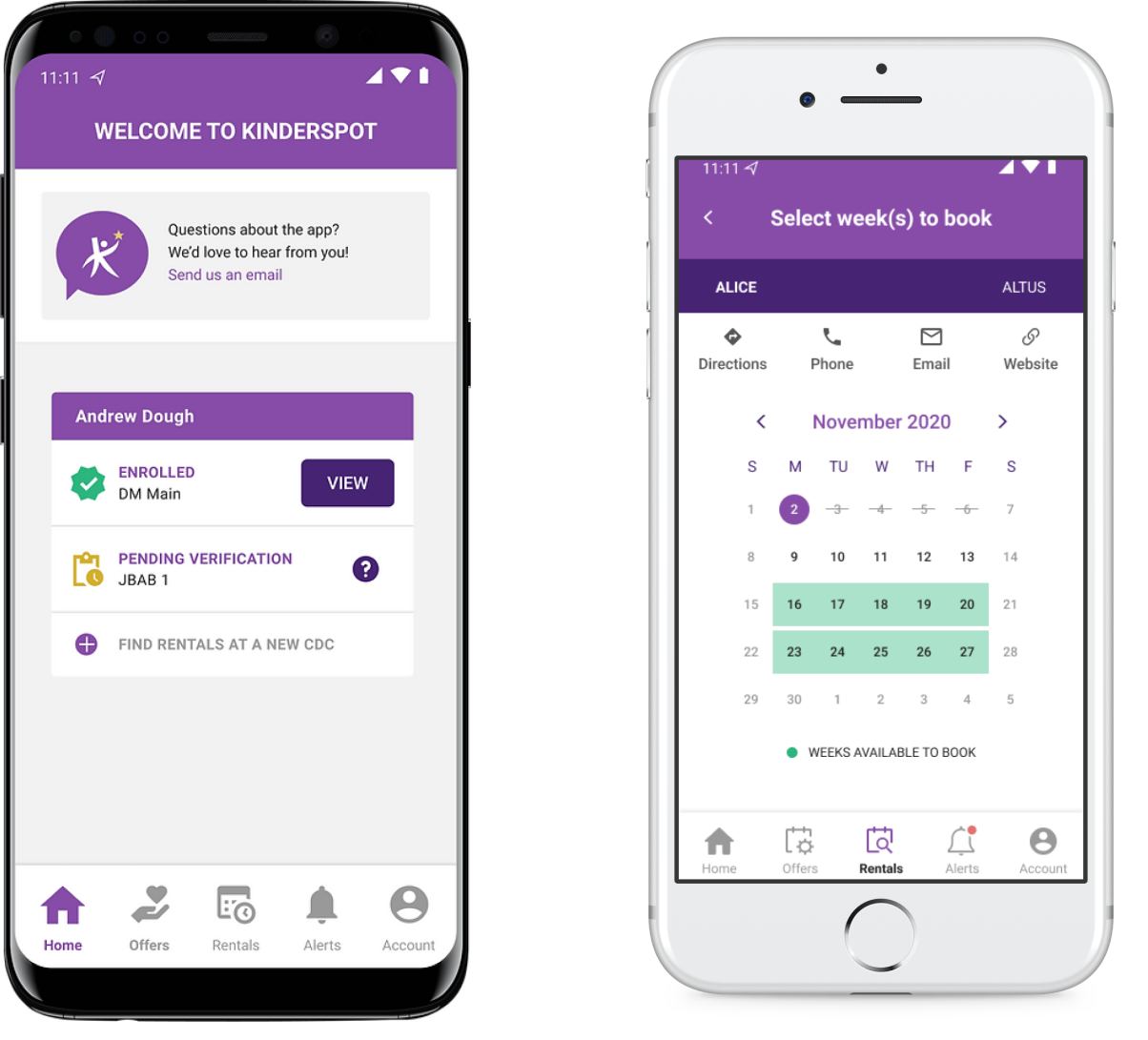
The biggest challenge with Kinderspot was that the Child Development Centers would only allow booking of complete weeks (Monday through Friday). We needed a clear way to convey this to users, since it is not a common feature of a scheduling interaction in most products. Early iterations had a note to that effect and required the user to simply select their start and end dates, with the app then asking whether they’d like to include the incomplete weeks.
We soon evolved to a two-screen process: the users entered their start and end dates on one screen and on the next, they were shown which bases could accommodate all or part of that request. On the second page, they could learn more about the CDCs and select, via radio buttons, which complete weeks they wanted to lease/let. This would later change to exclude the radio buttons but have the Weeks Offered outlined in green and function as push buttons.

USABILITY TESTING
Round One
The contracted team with whom I was working had never done usability testing before, and were somewhat surprised by the notion of testing something before the code is written. They were initially unsure that it was necessary to do testing because the design seemed intuitive to them. I explained that of course it would make sense to us, since we designed it; but we needed to see how real users would fare. It took some cajoling, but I finally convinced them
to let me run one round of moderated testing with five participants. I decided that if they didn’t see the value in the testing, I wouldn’t push for it again. We started by doing a guerrilla test with a team member who had just been added to our team, just to make sure the test would work on “real” participants. The test went well until it was time to select “Weeks to Rent/Sublet,” which our participant found confusing.
A Turning Point
The confusion that our team member experienced created an ‘aha’ moment for everyone: if someone from our own team is having trouble, how will outsiders do? By the time the session was over, they were all convinced of the value of usability testing, so much so that they began making notes about what needed to be tested in subsequent iterations. I counted this as a major win, not just for the project, but for helping other designers see the importance of testing.
For this first round of usability testing, we were primarily interested in learning A: how desirable Kinderspot was, and B: if users would understand how to select their rental period. We gave participants two different prototypes for the Spot Renter and Spot Owner and had them go through just one scenario for each. Our guerrilla testing session had given us additional questions to focus on and probe deeper as necessary.
What We Learned
Participants were overall very excited about the prospect of this becoming a live product, and many echoed the same confusion and frustration from our guerrilla session, which told us we had some work to do to make the app more intuitive.
““Love the concept, the design is great! Really excited for this to be released!””
SECOND ITERATION
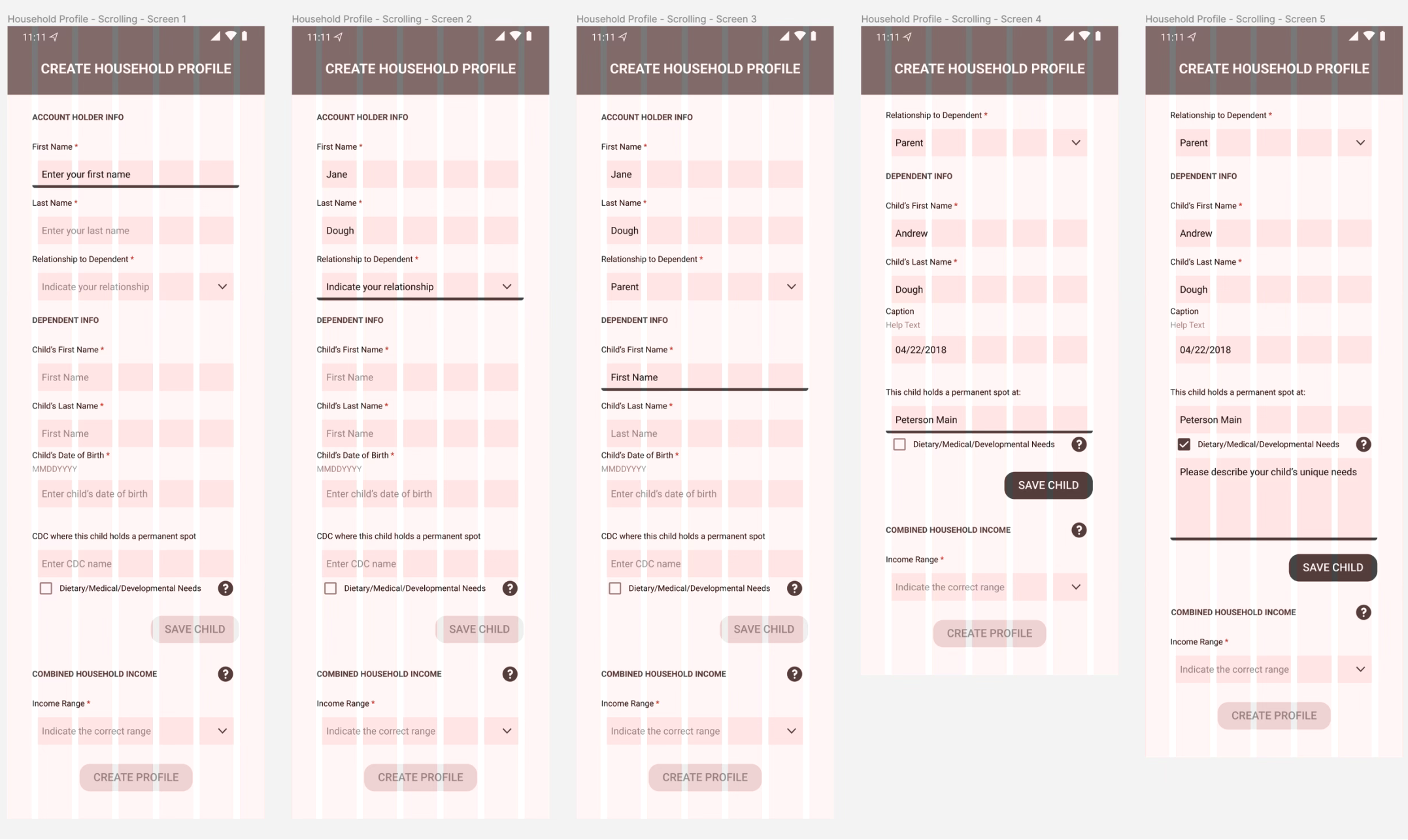
In addition to making the “date selection” mechanism more intuitive, we also set to work on the onboarding process so users could establish their household profile and select a payment method. We started working on an “explore” flow, allowing users who might want to take a vacation sometime in the future to look at what might be a feasible time, based on availability (or demand, if subletting).
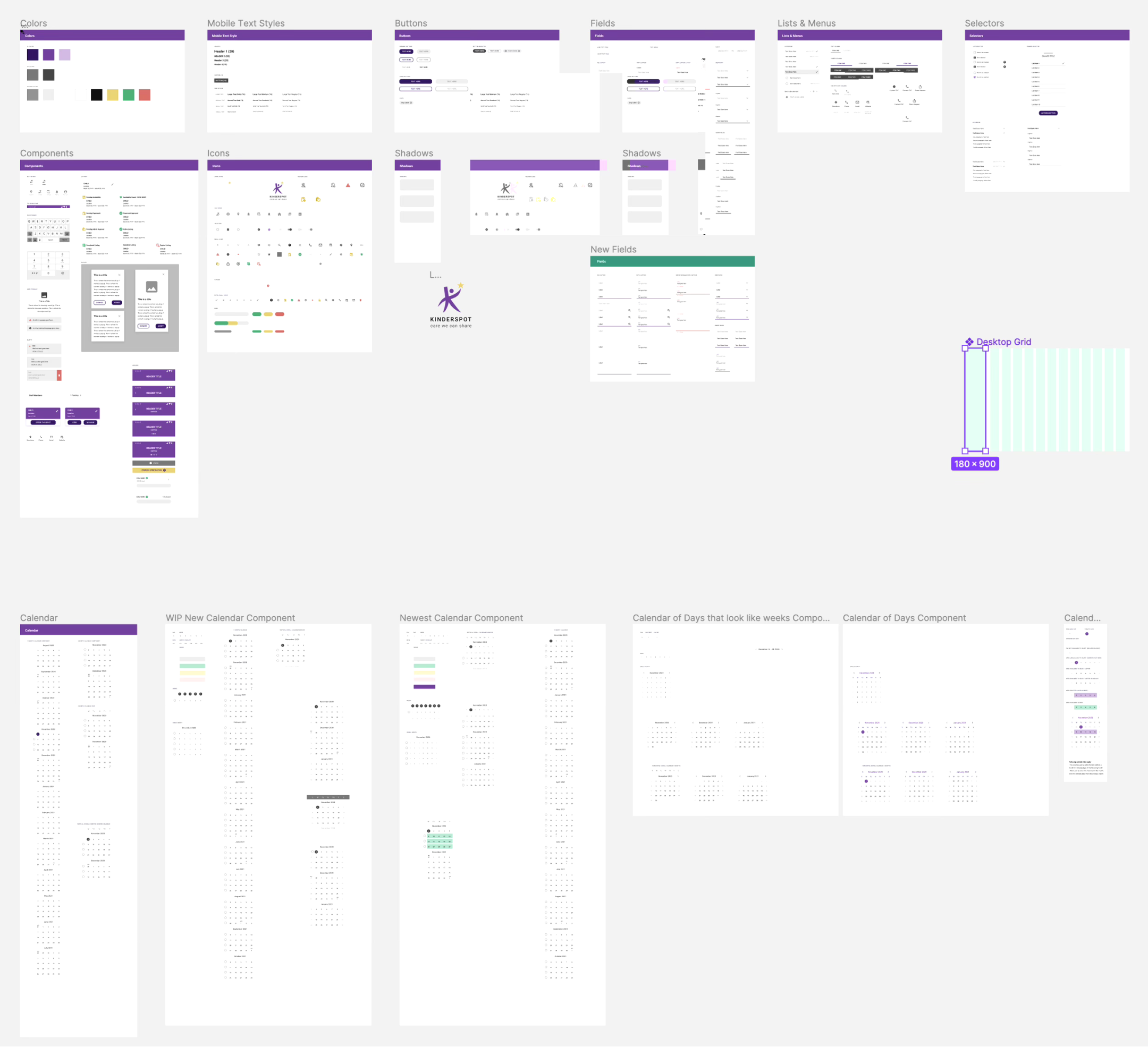
We decided also to start using Google’s Material Design System. For one, our early iteration already bore a resemblance to it. Secondly, and more importantly, we needed this app to feel familiar and give users a sense that it was mature and legitimate, and that they could trust it, both to arrange care for their children and to make and receive payments.
USABILITY TESTING
Round Two
To find participants for the second round of usability testing, we arranged to have these flyers posted at Child Development Centers:
We were able to net eight participants, with them again broken into two groups: 5 doing task completion, and 3 doing cognitive walkthrough.
We prompted test subjects to find childcare for two hypothetical children during a temporary duty assignment at another base for a time that did not fit neatly into complete weeks.
Feedback was, again, generally positive. However there was some confusion about pricing/payment, whose spot they were taking, and where the paperwork lived. Users also asked about the following:
• Clearer instructions around password requirements
• Improved search functionality when browsing a longer list of CDCs
• More information about the CDCs.
• Better support for multiple child rentals
• Alerts when specific offers are available
THIRD ITERATION
& Visual Design
Following usability testing, we began implementing the features our participants felt were missing, many of which were already in the works but not ready for testing. Our design system, based on Google Material, had grown and been refined from our first iteration to include different styles for mobile, calendar components, and a desktop grid.
A/B TESTING
Create an Account
The final round of testing was to A/B test two different flows for account creation. The main difference between these two flows was how much information would need to be entered on a single screen.
Option A was a single screen that would expand to fit each new piece of information, whereas option B was broken up into multiple screens: username/password > user information > child information > household income.
Over 42 unmoderated sessions, option B was the clear favorite with 28 votes versus 14 for option A. Some users voiced concern over having to use their military email address and would prefer to also include their personal email.

REFLECTIONS
Lessons Learned
Kinderspot successfully launched April 2021 at nine participating Child Development Centers. Two years later, it was used by 22 CDCs in the US, and today, it is available for use at 100% of Air Force CDCs worldwide.
I am proud of the work I did on this project — not just because it was a success according to time, budget, and adoption — but also for my contribution toward mentoring a new designer and helping another, more seasoned designer see the power and possibility of pre-development usability testing. It was the first project on which I worked entirely in Figma, and also my first time working with an established design system, so it was a great learning experience for me.
Given the opportunity to do it over again, I would push for usability testing sooner, since I was accustomed to running usability tests at AF Cyberworx and because I had a hunch the selection process was not intuitive. I possibly would have also built a separate prototype in Axure, for the purposes of both enabling more robust testing, and to speed up the prototyping process.